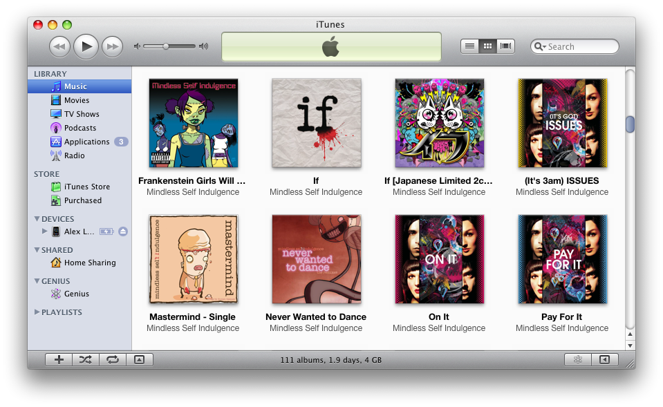
I am appalled at Apple and what they’ve done with iTunes 9. Sure, they’ve included some important functionality and all, like app management and a new interface for the iTunes store, but did they really need to make it so fricken ugly? I mean, just take a look at the thing:

iUgly
Fucked up gradients and blindingly white backgrounds? Why, Apple, why?!
Oh, and Mindless Self Indulgence kicks ass; check ’em out.
In other news, Apple updated their line of iPods. The Shuffle now comes in more colors and still kinda sucks, the Classic got a space bump to 160 GBs for the same price, the Nano got a sparkly new camera, and the iPod touch got a processor bump and still has no camera (and here’s some theories on why).
All in all, not too exciting for an Apple event. Steve’s back on stage with the liver of a 20-something-year-old who got hit by a car. That’s interesting, right?
Update: Apple’s released footage of the keynote which is available for download here.
Update 2: You can make iTunes 9 less ugly with this unofficial patch (OS X only, for now).


November 11th, 2009 at 11:51 PM
Ramil, I don’t use the playlist feature, so I haven’t seen any bugs with it. A quick Google search gave me this. Hope that resolves your problem.
November 11th, 2009 at 7:33 PM
Ok, why isn’t anybody commenting about the smart playlist problem. Am i the only one having this problem. When I upgraded to Itunes 9, the playlist on my ipod touch is all out of sync with my itunes playlist. Nothing is in order. Even when i create an on-the-go playlist is still out of order. Anyone has this problem and do you have any solutions ?
September 23rd, 2009 at 5:30 AM
Happy I got my 16Gb Touch just before new iPods.
The new iTunes store is much easier to use I think but other than that I think its messed up. Very ugly. So ugly I switched back to the old list layout for my songs.
September 12th, 2009 at 2:54 PM
The aesthetics of iTunes 9 makes me think of Vista. Corporate espionage perhaps. Or
Apple hired the Pontiac design team. In any case, it clashes with Safari and needs to be fixed. I just hope they don’t shine up Safari to match it.
September 10th, 2009 at 8:38 AM
I dont like the new iTunes look too.
Don’t combine with other apps in OS X
September 10th, 2009 at 12:42 AM
iTunes 9 is gross looking. Was pleased to google “itunes 9 = ugly” and find your post.
For a company as aesthetically astute as Apple, its truly mind boggling why they updated it in this fashion.
September 9th, 2009 at 10:32 PM
I found MSI a few years ago…. I agree with you on them. And I am pissed the Touch has no camera. I was set to purchase my first iPod to replace my iRiver from 4 years ago. I have the cash in hand, but no Touch for me yet.
September 9th, 2009 at 10:41 PM
I wanna know what the hell happened to the 16GB model. 8GB is way too small but 32GB is overkill for what I need and it’s too expensive. If only there were something in the middle…