Windows 7 has been quite a hit among Windows users, some calling it what Vista should have been. I’ve used Windows 7 as a secondary OS since the public beta, and I’ve never really been comfortable with the new taskbar. These are the reasons why.
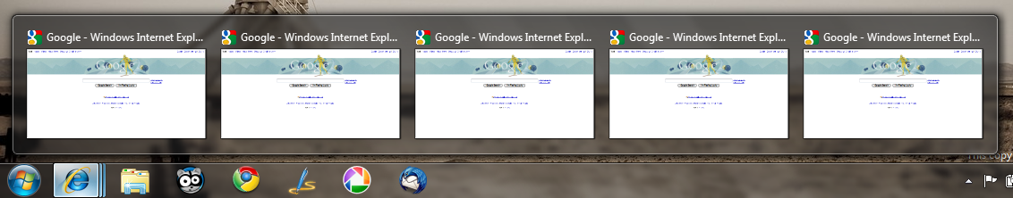
That extra click—By default, the Windows 7 taskbar groups instances of the same application together, so that all your windows are contained in one icon. This isn’t really a new feature, it’s more like a revised version of the grouping that Vista and XP users are familiar with. It’s more functional, yeah, and it’s pretty, but it also gets in the way. The most contentious thing about this new behavior pertains to web browsing. Internet Explorer is set up to show each tab as a different window in the taskbar, and more browsers are following suit. This is wrong. Let’s say you have several tabs open in IE, now you minimize the window and go work on something else. Now, when you want to go back to working in IE and you click on the icon, it doesn’t just automatically switch you to the last tab you had open. No, it pops up a preview of all your open tabs and asks you to pick one. This requires two clicks instead of one, and subverts the native tab-management of the web browser. Also, the taskbar makes no distinctions between tabs and windows, so if you had several tabs open along with a couple windows, each showing the same site, you would have no idea which one is a tab and which a window. Quick! Tell me which ones are tabs and which windows:
I’m not saying that this behavior is completely useless; it just shouldn’t be the default. Clicking on the icon should bring me to the last window/tab I had open, and control click or hover click should take me to the preview thing. Thankfully, though, you can return some sanity by selecting the option to never combine taskbar items in the properties menu.
Text labels are illegible—This one is pretty ridiculous. When you turn off that annoying combine feature, you get the good old text labels back! Too bad they’re damn near illegible when you hover over them. The default highlight intensity for the active application is ugly and bright, and the text blends into the brightness.
![]()
Notifications—On windows, application notifications are shown with a flashing orange color on the taskbar icon. But what if you choose to hide your taskbar? You can still see the notifications, but it’s just a small sliver of the screen that flashes. In OS X, the Dock handles application notifications differently: icons bounce, so when your Dock is hidden, the application bounces into view, which makes it pretty obvious.
It’s Still Application-Centric—You’re probably wondering what exactly I mean by this. To understand my point, I’ll have to talk about one of the major differences between OS X and Windows. In OS X, when you close a window, you don’t close the application; you just close a document. The application is still running, even with all of its windows closed. In Windows, when you close an application’s window, you close the application as well, because the application is the window. This means that when you open a new document in Windows, you’re basically just opening the application again, and that eats up resources. Back in the days of Windows 95, this wasn’t a problem, as the computers of that era were adverse to multitasking. But computers today certainly aren’t, with 4GBs quickly becoming the standard for RAM. Several different systems have evolved to try to address this problem, like the Multiple Document Interface, or MDI, pictured below:
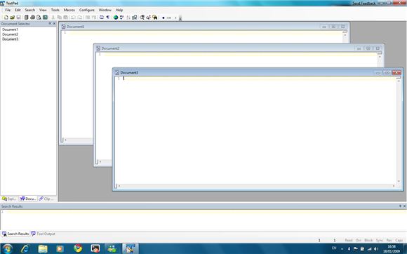
You can easily see the flaws in this system: documents are stuck inside a parent window, limiting the space in which they can be dragged around. The taskbar hasn’t really evolved to take advantage of MDIs, and you can’t switch to a document inside an MDI window. If you want a more in-depth examination of the differences between the Dock and taskbar, read this excellent post over at Ars Technica.
It’s not an application switcher—The really big problem with the taskbar is that it’s not an application switcher, and hasn’t been since Windows 95. OS X’s Dock, however, is an application switcher, and should remain that way, with window-switching being left to Exposé. Apple was smart in not integrating window-switching and application-switching into one user interface element, like Microsoft has. The Dock is already doing too many things at once, as is the taskbar. Which leads me to my next point . . .
It’s still overcomplicated—Yes, it is. Don’t say it isn’t, because you know it is. Deep down in your heart, you know. Seriously, the taskbar in Windows 7 is responsible for application launching, application-switching, window-switching, application notifications, explorer shortcuts, system notifications, and time. That’s quite a lot for one user interface element to handle, and that doesn’t include the numerous functions of the Start Menu (which is also ridiculously overcomplicated).
Well, that’s it for my gripes with the Windows 7 taskbar. Tell us your thoughts in the comments.


July 9th, 2012 at 2:41 AM
What sucks too is:
– Ever started Taskmanager by just moving the mouse to the very bottom of the bar and open context menu ?! Not possible with anymore, that single pixel line, allowing to open the context menu of the taskbar is gone.
– You’re used to close tabs with “middle mousebutton”, try it on the superbar, you OPEN another instance of the application you wanted to close, wtf !?
– Did you close some apps by context menu of their taskbar tab ?! The menu opened directy above the tab in former versions. Now the mouse must be moved and targeted to hit the “close” entry.
– Ever had an mad application that opened 20+ windows (error messages, e.g.) ?! You once could just press CTRL and select all tabs in the taskbar and then close all at once by context menu. You cannot do so anymore.
This Superbar is for kids, girls and facebook people, knowing nothing of windows and computers and how one was able to get work done with it quite efficiently.
I recommend “Windows 7 Taskbar Tweaker”, it turns the Superbar into something useful again, give it a try.
tbone
November 27th, 2011 at 5:39 AM
You are right on the money.
Yes its more stable but when you are working with at least 6 programs at the same time, this new taskbasr sucks. It would be a reason for me to switch back to XP.
August 24th, 2011 at 2:21 PM
Very interresting colletion of agruments.
After I read your text I completely seen myselfe screaming whats missing in windows.
I totally remember the hype of the “3d-Switch” application with WinKey+Tab. Totally cool feature, and that took Microsoft 2 Years to develop. This must be a joke (yes I am including aero here).
On coleague once told me: “We see how windows was designed for users who only start 3 different programms a day, weather in office or at home”. I can completely understand this type of people. They normally do not need to do more things than browsing and writing mail. They will propably love this kind of userinterface.
I work as a developer. I use a multihead windows system with 2 Screens. One virtual machine is open at almost all of the time, and a developer environment. Then there are text editors, office programms etc. Seriously that new osx doc imitation looks like a great tool to handle that many (different) programms, but it isnt from my experience.
I worked with MacOS/Linux/Windows/Dos/GeOS/BeOS and every OS did a better job than Microsoft did the last few years implementing their userinterface for doing professional work.
I currently switched back to a windows shell replacement (emerge desktop for people who want to try out without configuration or the need for compilation).
Right now I completely think about moving to linux just only becouse it has tiling window managers (or other types who you can think you can work best with like plain text stacked window managers or 3d window managers).
And the best of all you do not need a mouse to use your system. Everything can be done without mouse. If you like to command your userinterface with shell like commands, it can be done.
One thing:
I really like windows. It is software which you pay for. You install it and can use it. But I dont not understand why they are selling tons of different windows 7 versions who all are made with the simple “using 5 programms at once” type of userinterface.
Neither do I understand their pricing policy. Windows costs almost an arm and a leg compared to other great operating system (who are updated more frequently, and where updates cost you only a few bucks).
It may be hard but it is my opineon, thank you Microsoft for making a once great os usable to the masses and unusable for the few of us.
April 13th, 2011 at 12:20 AM
YESSS someone agrees with me on this stuff, especially the way Windows stupidly highlights the current window.
From a design stand point, our eye is attracted to contrast. Giving the current label WHITE text on a BRIGHT background doesn’t make much sense, especially if the other labels are highlight with some white as well. Yes, it looks nicer as an *ambiguous form*, but it hinders the real purpose of the taskbar. The XP did a much better job, with it’s WHITE text on DARK background of capturing the eye and immediately telling the user which window is the current window.
Does anyone know of any way to remedy the illegibility of the text labels?
November 9th, 2010 at 3:58 PM
Another problem I have with W7 is the unability to make the taskbar NOT always on top. This XP-feature simply disappeared.
November 9th, 2010 at 4:37 PM
I believe you’re referring to Auto-hide which can be enabled in taskbar Properties.
November 9th, 2010 at 8:21 PM
No, I mean really that the taskbar can stay under other windows and autohide so you need to click it to bring it to the front. this is useful if you have programs which unhide the taskbar automatically. Having the taskbar NOT always in front is less annoying. Unfortunately this checkbox is gone in W7.
April 28th, 2011 at 6:39 AM
Alex are you a programmer?
In the It’s still application-centric area I have this to ask.
Your argument saying that re-opening a program/application on windows eats resources is confusing and the way I think you said it, would be false or misleading.
On Windows xp/Vista/7, when you open an application, it uses your RAM so it can run. When you close an application that process is ended and any memory it was taking up also becomes free for other applications.
When you open the application again, it uses the exact amount of resources it was before, assuming you’re doing a similar task (comparing making a 800 word document to a 5000 word document), and no more.
This hasn’t much to do with the actual gripes of the Windows taskbar, and most arguments I agree with wholeheartedly.
April 28th, 2011 at 8:49 PM
No, I’m not a programmer. I agree that it’s confusing and that section doesn’t have much to do with the taskbar. I’ve been meaning to rewrite this post for a long time, but never got around to it.
September 15th, 2010 at 12:41 PM
I’m just starting with Windows 7, and I agree with you on most points. I’ve immediately turned off window grouping, set up a new toolbar that does the job of the old quick launch bar, etc.
But I can’t find a workaround for the highlights on the taskbar buttons. (I got here by Googling “windows 7” taskbar button background illegible.) I can choose a nice dark color for the background, but it does insist on adding that annoying highlight at the top (and for the current window, the bottom too) which is giving me a real headache.
December 25th, 2010 at 5:47 PM
I hate the freakin highlights, I simply cannot find the
current active window among all those highlighted items!
August 21st, 2010 at 11:30 AM
Most commenters above just don’t get it. I agree with everything the author is saying. And I have more to add.
On Small screen, the dock is too big. Make the icons small, then the icons become too small (compared to the taskbar, and has too much free space around it). This wasn’t the case with XP.
I do agree the text is too bright, and BTW, there’s no issue with my friggin gamma settings. I’m just used to a more aesthetically pleasing OS.
June 22nd, 2010 at 5:22 AM
I can tell you that I searched deep into my heart, but no, I still don’t think it’s complicated. At all.
I don’t really like the Mac OSX dock, I find it to be counterproductive, and that the new Windows 7 Supertaskbar allows you to use it in whatever way the user prefers, which I think is the perfect solution to a preference-driven subject.
The Supertaskbar is also clearly more attractive, and any gripes about not being able to see text in ungrouped view due to colours is completely petty – if it really is a problem, a change of colours is a few clicks away – as, I’m sure, is changing the colour of the OSX dock, if that is even a feature.
May 12th, 2010 at 10:19 PM
God damnit, Windows is and always has been DOCUMENT CENTRIC and Mac OS is and always has been APPLICATION CENTRIC. If you’re going to bitch about it, at least get it right.
April 19th, 2010 at 2:44 AM
Congrats..glad someone finally said it. Windows 7 taskbar sux ballz. Compared to Mac OS X it is very inefficient. What a headache.
April 9th, 2010 at 7:11 AM
Alex, if you purport that the purpose of this article is to outline your opinion of the W7 taskbar, you should have called it ‘Why I don’t like the Windows 7 taskbar’, not ‘Why the Windows 7 taskbar sucks’.
And to pick up on a couple of points in the spat between yourself and Thomas –
– The colour/text issue is probably related to your screen calibration and gamma, which is probably set differently than in OS X. My monitor is calibrated by a proper calibration device and the image you screen-grabbed looks crystal clear
– The OS X dock switches windows too – just right click the dock icon. Therefore it is an application *and* window switcher
– The fact that you find alt-tab less intuitive in Windows than command-tab in OS X means that MS have done their job in making the GUI easier to use than a simple keyboard shortcut. You could also read that I’m implicityly saying that OS X have done a poor job in designing the GUI as the command-tab shortcut is easier than using the GUI. In OS X, I really hate the fact that to switch windows (or to switch to a specific window in another application) I have to right click (an action in itself that has historically been a secondary and unimportant function in Mac OS) the dock icon and select the window, or go to the window menu.
– Yes, in W7, I agree it can sometimes feel long-winded to have to select your window once you’ve selected the application from the task bar, but I’d much rather that, than switch to the application, then have to find the Window menu and select the window from there – that’s even more long-winded!
FYI I use both W7 and OS X at work and at home, and like the both in equal measure, and there are times when both annoy me.
April 1st, 2010 at 3:19 PM
I can not agree more! Win7 taskbar is the main problem I have with it and might be the ultimate reason I never boot to windows anymore and stick with my Ubuntu!
The taskbar buttons are just too bright and for my eyes it is very hard to tell which application is active (I have them ungrouped).
Very very annoying!
March 1st, 2010 at 8:49 PM
Your points are:
1. Being able to turn off a behavior makes any argument against that behavior pointless.
2. The taskbar does switch applications.
3. You can’t criticize something because it isn’t simple.
4. You can’t bring in other programs if you’re comparing the taskbar to the Dock.
My rebukes:
1. That’s a logical fallacy: Just because I can turn the behavior off doesn’t make my criticisms of that behavior any less valid. And what if I don’t want to see text labels? What if I want to use the preview feature for windows and not tabs? I’d probably have to mess with the registry to do that, and I can’t find anything about it on Google.
2. It doesn’t. It switches windows, and in the process, switches applications. That’s very different from just switching applications, like the Dock does.
3. I doubt you’d say the same thing if I were criticizing the US tax code, which as of 2003 was comprised of 54,846 pages. I don’t need to know anything else about it to criticize it. The old adage holds true, especially in interface design: The simplest solutions are often the best.
4. I never explicitly stated I was comparing the taskbar to the Dock. If I were comparing the two explicitly, the title of this post would have been “Why the Windows 7 Taskbar Sucks in Comparison to the OS X Dock.†The reason I bring up the Dock is because it’s a convenient example, both because I know it and most readers know it as well, so they can better understand what I’m talking about.
On a tangent note, I have a philosophical bias against Windows. Microsoft likes to integrate everything as much as possible (e.g. Explorer, the Registry), whereas Unix and Unix-like systems follow the Unix philosophy, which can be paraphrased as “Write programs that do one thing and do it well, and have those programs work together.†This difference is exemplified by Explorer. When Explorer crashes, the taskbar goes down with it. On the OS X side, when the Finder crashes, that’s all that crashes; the Dock, Menubar, and Exposé remain active. Microsoft globs everything into Explorer; Apple creates different applications and has them work together. Which sounds like the better approach?
February 28th, 2010 at 1:52 AM
That extra click — My issue isn’t only with IE. As I mentioned, more browsers are following MS’s example. In fact, every major browser is. I believe Safari and the Opera 10.5 beta already do it. This behavior goes back to the application-switcher vs. window-switcher debate. It makes more sense to switch applications first and then manage windows, since the applications create the windows.
Text labels are illegible — This is more an aesthetic issue; I just think the highlight color is garish and way too bright.
Notifications — If you’re talking about distractions: can you turn off Dock notifications? Yeah. Can you turn off taskbar application notifications? Not that I know of.
It’s still application centric — Of course, not all applications conform to standards. That’s why I mentioned the MDI. Yeah, this one’s definitely confusing: calling it application centric and then complaining that it isn’t an application switcher. I chose a bad name for that section. What I mean to say is that the taskbar hasn’t evolved to compensate for the window = application paradigm. Even MS’s own programs don’t play nice with the new taskbar. Maybe that’s more the fault of how the OS handles windows, but then, the taskbar handles windows, doesn’t it?
It’s not an application switcher — Alt+Tab always seems less efficient than just using the mouse — at least for me. And, if you’ll note, Alt+Tab in Windows doesn’t switch applications; it switches windows. (And Flip 3D is a gimmick, in my opinion). You’ve missed my point, though. The taskbar isn’t an application-switcher, so it can’t be better at application switching than the Dock. If you’re going to compare the window-switching aspects of the taskbar, you’d have to compare it to Exposé, and I think Exposé handily wins there. As for it being a separate application: so? I’m not explicitly comparing the taskbar to the Dock, so I can bring in other applications on the OS X side.
It’s still overcomplicated — Ouch. A four-year-old? Really? My sister’s 25 and she barely understands the taskbar. Common’, Thomas. You know most computer users aren’t that computer literate; just look at the tech-support industry. I agree that this is the best Start Menu yet in Windows, but it’s still the Start Menu.
Conclusion — I dislike both the Dock and the taskbar. I dislike KDE’s Kicker, GNOME’s panels, LXPanel, and PyPanel. About the only taskbar-like application I like is Tint2, and that’s because it’s so simple there’s basically nothing to dislike about it. I have a bias against every user interface, because none of them are prefect. And the taskbar shouldn’t be criticized? Of course it should! This is how Microsoft learns! It’s how every developer learns! To not be critical is to be unhelpful. However, there’s a line between criticizing and bashing. I’m not bashing the taskbar; I’m pointing out why I don’t like it.
(Sorry, Thomas, I know you don’t think the taskbar shouldn’t be criticized at all; I’m trying to make a larger point there.)
March 1st, 2010 at 1:12 PM
That extra click– See “Notifications.”
Text labels are illegible– This can come down to monitor settings, user preference, and countless other variables, so this argument could simply go on forever. In other words, I’m willing to drop this one.
Notifications– I thought your argument was solely about the default operations of functions/features in an OS. If you’re allowing the otions to be changed then you’re entire argument about “That extra click” goes out the window, as the supposed annoyance can be turned off.
It’s still application centric– No matter how you look at it, it comes down to the specific program and how it’s coded.
It’s not an application switcher– I continue to miss your point. How doesn’t the taskbar switch applications? That’s its main function- to switch applications. And I think it does so ingeniously. It also picks up on the docks downfalls, as it not only handles applications, but windows as well. You can’t hate on something solely because it isn’t simplistic. Simplicity isn’t always the best way to go, and I think the taskbar is one example of where it wouldn’t work. Yet, it remains simple enough for the average user to get by, but advanced enough for an advanced user to take advantage of all it has to offer.
It’s still overcomplicated– See “It’s not an appliction switcher.”
Truly anything can be accomplished with extra programs, and thus I think that if you’re going to compare the taskbar to the dock, then compare the taskbar to the dock. But don’t bring in extra programs such as expose to get around the downfalls of the dock. Compare the features of the dock/taskbar, and nothing more.
February 27th, 2010 at 10:36 AM
I have to say that I couldn’t disagree more. Let’s examine your post, point by point.
That extra click- The issue you have rests solely with Internet Explorer. While it is true that Internet Explorer’s tabs and windows are handled rather oddly, this doesn’t serve any attention and can easily be shrugged off. Why? For starters, if you’re using Internet Explorer, you deserve the extra trouble. Second, as you mention, the feature can be remedied by turning off Grouping. Third, it’s easier to navigate multiple windows for an application inside of Windows than it is in OS X. In Windows, you at least get a preview; OS X simply gives you a text-based list when you right click on the app in the dock.
Text labels are illegible- Have you had your vision checked recently? The text is not only clearly legible, but the highlight function is much needed. I would even argue that the brightness adds to the sexiness of the Aero effect. Maybe it’s just you, or it’s just me, but I think the text is clearly distinguishable from the background, whether it is highlighted or not.
Notifications- When I have my dock/taskbar hidden, I have it hidden for a reason; I want to focus on my current application and nothing else. I find it a great nuisance and also a bit contradictory to have a function that’s supposed to hide something, yet it bounces back into view (aka OS X dock and notifications). The taskbar got this one right as it gives you a small, unobtrusive notification so that you aren’t distracted from your work, yet you can still find it if you’re looking for it.
It’s Still Application-Centric- The ability to close a window and have the application remain open is application-specific in both Windows and OS X, though it is much more common for OS X applications. So though I do agree that the ability to close a window without closing the entire application is a great feature, it has nothing to do with the taskbar (or the dock in OS X), but rather how the specific program is coded. Not all OS X applications will remain open if a window is closed, and the opposite is true for Windows; not all programs will end if the window is closed.
It’s not an application switcher- I don’t think I fully understand this point. Application switching is left to Alt+Tab or, more visually appealing, Windows+Tab. OS X shares this function as its keyboard shortcut is Command+Tab. And while we’re on the subject, I’d like to point out that Windows does this more functionally than OS X; Windows displays the name of the program, a preview of the window/tab, temporarily brings the window to the front, and then displays the program’s icon. What does OS X display? Icon and name. Who’s better at application switching?
Now you did mention Expose, but I would consider that an entirely new program, separate from the basic integrated features of the OS. And OS X requires help of an entirely new program to match the basic functionality of Windows.
It’s still overcomplicated- To whom? A 4-year-old maybe, but certainly not a computer-literate being over the age of 10. The taskbar deserves to be complimented for hosting all of this functionality without being overcomplicated. Since you didn’t get into Start Menu, I’m not really going to either. I’d just like to add that this is the best Start Menu Windows has ever built, and I commend them for it. Overly complicated? I think not.
The way I see it, you don’t really dislike the Windows Taskbar; you just favor the OS X Dock. And while I can understand a bias towards one, I don’t feel the Taskbar should be criticized as it is much more functional, yet remains nearly as simplistic as the Dock. Point is, they each do their own things great, and both have their downfalls.